macOS 27 Public Beta
The macOS 27 beta fix that Apple fans have been yelling about for years
Apple's macOS 27 Golden Gate public beta dials back the Liquid Glass craziness, adds a menu bar overflow button (finally), and gives Siri a voice you can actually tune. Hands-on impressions from M5 MacBooks.
Emmanuel Fabrice Omgbwa Yasse AI-assisted
2026-07-18 · 3 min read
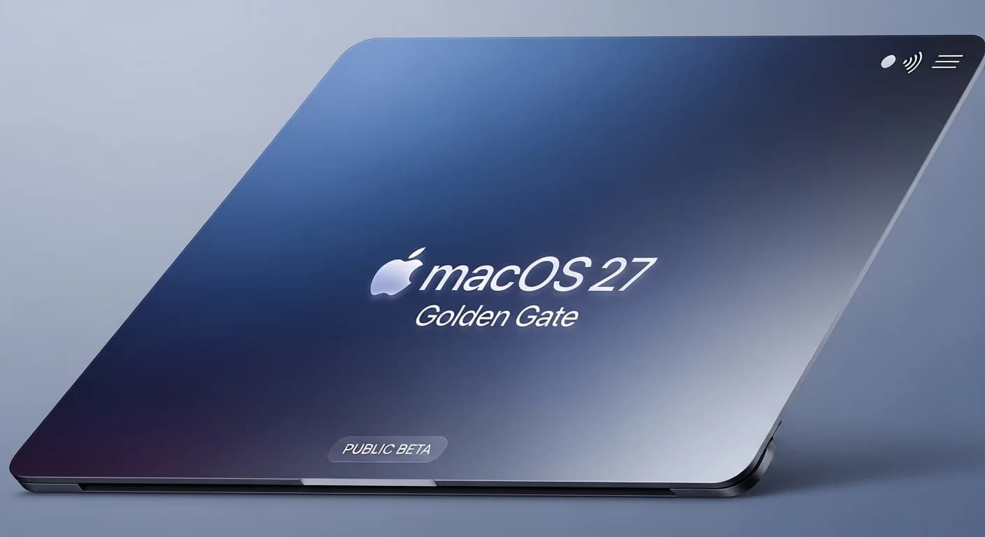
The public beta of macOS 27 Golden Gate is out, and for M-series Mac owners it offers a tempered version of the Liquid Glass look that debuted with macOS 26 Tahoe. The beta dials back the transparency and glass effects, making the interface less visually busy. People who found Tahoe's glass-heavy design distracting will likely see this as a solid step forward, echoing similar design philosophy shifts seen in other ecosystems like Windows 11's recent search cleanup.
I tested it on an M5 MacBook Air and an M5 Max MacBook Pro, and it held up well for daily use. No unusual battery drain or overheating, which is more than I can say for some past developer betas. It is stable enough that early adopters willing to deal with the occasional bug won't regret jumping in. This kind of polish is reminiscent of how Anthropic's Sonnet 4.6 quietly improved performance without changing the price.
The good: Less glass, more control
The biggest change is the refined Liquid Glass design. Window corners now share a uniform radius, and the File Explorer and app sidebars look cleaner. Apple also added a menu bar overflow button: a double-arrow icon that shows hidden items when too many menu bar apps push things off-screen. It is a fix for a problem anyone with a full menu bar has griped about for years. It's Apple paying attention to the little things, much like how Opencode added the feature developers actually asked for.
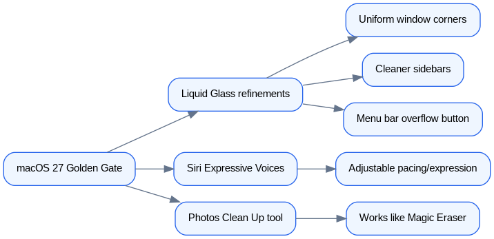
Siri gets a real update with Expressive Voices, available in preview in developer beta 3. You can adjust pacing and expressiveness across five levels for both male and female American English voices. Making Siri talk faster and with less expression, basically making it more robotic and to the point, is a welcome feature for anyone who just wants the assistant to shut up and answer the question. This customization is a step toward the kind of personal assistant experience that developers can build from scratch with OpenAI's stack.
The Photos app's Clean Up tool works like Google's Magic Eraser, and in my tests it did a good job. I had it remove a fly from the middle of a detailed flower photo, and it handled simpler tasks like cleaning up greenery from a sky corner just as well. It is no replacement for Lightroom or Photoshop, but for casual photo editing it is more than capable.
The meh: Reframe, extend, and Siri AI
Not everything works. The Photos app's Reframe and Extend tools let you crop and expand a photo beyond the original frame, but results are mixed. In one test, Reframe turned a plane in the sky into a fake-looking AI mockup. A rabbit photo got weird proportions. The Extend tool works okay but Apple Intelligence sometimes fills in filler content that looks sloppy. This highlights one of the hardest problems in AI: teaching models to be good judges of their own output, a challenge that recent research like Hugging Face's work on evaluation aims to solve.
Siri's larger AI upgrade is more capable than the old version, but I still rarely use it for serious queries. The assistant integrates into search and lets you ask questions by voice or text, but it still gets things wrong often enough that I don't trust it for factual questions.
Minor annoyances and adjustments
An "Ask Siri" option now shows up in the right-click context menu sporadically, which shifts the menu's position. The battery percentage indicator moved inside the battery icon, matching iOS. It is less readable at first glance, but you get used to it quickly.
Despite these quirks, Golden Gate is a clear improvement over Tahoe. If you already put up with the glass-heavy design, this is nothing but a better version of it. Whether it convinces people who stayed on Sequoia to give Liquid Glass a shot is a different question.
Get the tech essentials in 3 minutes every morning
One email, every weekday, with what actually matters in AI and tech.